Brand Guidelines

Visual Identity

Made to move

The FLOR visual identity brings the brand’s value + philosophy to life. Focused on movement and creativity, the identity system builds in flexibility for mutable messaging and styles, demonstrating infinite design possibilities within a supportive, principled framework.

The visual brand is playful and confident. It conveys simplicity and invites interaction. It is the design experience, made visual.

Visual Identity

Modular
Grid

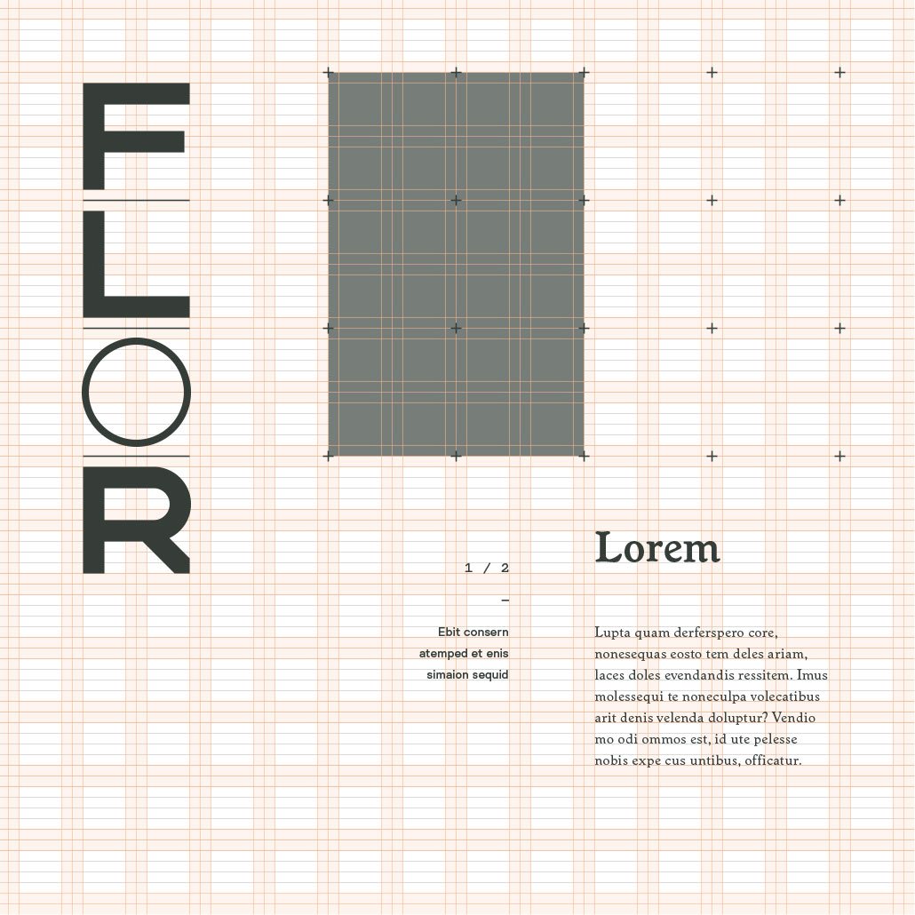
Focused on movement and creativity, the identity system builds in flexibility for mutable messaging and styles, demonstrating infinite design possibilities within a supportive, principled framework.

The visual brand is playful and confident. It conveys simplicity and invites interaction. It is the design experience made visual.

Logotypes

Primary

Primary lockup is vertical with horizontal being a second choice. Vertical most often fits easier at eye level on a streetscape for signage. The horizontal lockup works when a large amount of wide facade space needs to be filled.

The goal is maximum understanding and readability of the FLOR logo with most effective orientation based on unique space consideration. Store presence and recognition should be well understood.

1 / 3

Minimal flor awareness,
maximum presence

1 x 4

Primary
vertical
Download Set

4 x 1

Primary
horizontal
Download Set

Secondary

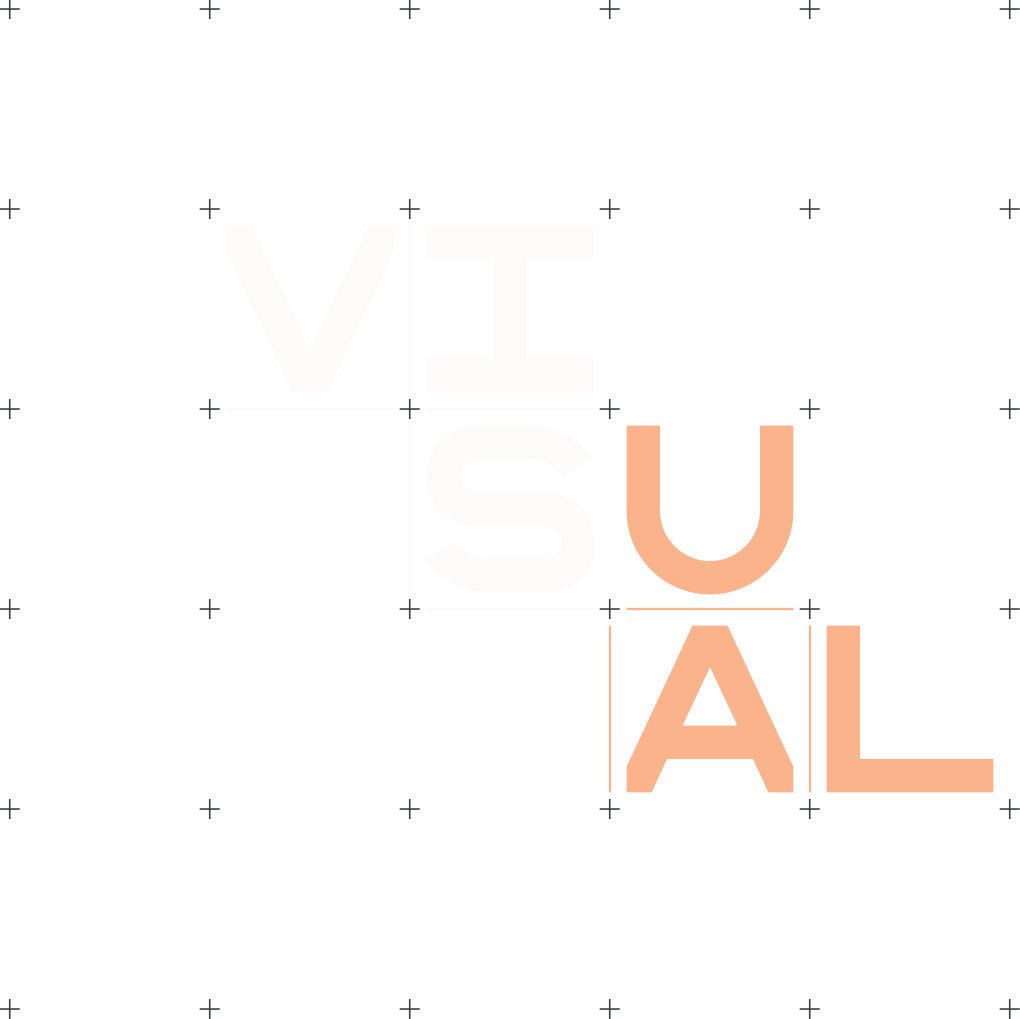
The scattered approach of the secondary style fits nicely into a 2x3 and 3x2 scenario. It’s meant for in-store and box cover situations. In-store, it will most often be used for larger concept words like “design” or “sustainable.” The box would utilize a 2x3 or 3x2 “FLOR” logotype.

The scattered lockups are meant to reflect the in-store design process and options of designing a rug. Moments where creation and assembly of squares is happening would be where this lockup is executed. This can include web interfaces of the FLORbuilder loading animation.

2 / 3

High flor
awareness, interior
concept words,
purchase presence,
design reflective

2 × 3

Secondary
vertical
Download Set

2 × 3

Secondary
horizontal
Download Set

Tertiary

The square lockup is meant to be used in catalogue cover execution. The presence of square lockup signifies the convergence of fundamental FLOR catalogue concepts, including: Color Palettes, Product (squares and swatches), Story, Spaces (example rugs).

The square represents these elements coming together to create a unified brand, browsing, design inspiration, and catalog experience.

3 / 3

Medium flor awareness,
design & core
concept reflective

2 x 2

Tertiary
Download Set

Logo Lockups

Symbol

Primary lockup with registered trademark symbol is vertical with horizontal being a second choice. The horizontal lockup works when a large amount of space needs to be filled.

The registered trademark symbol should always accompany each lockup of the FLOR logo sets. Its small size is responding to spacing within the design grid.

1 / 3

Maximum readability,
space responsive

1 x 4

Primary
vertical

4 × 1

Primary
horizontal

2 × 3

Secondary
vertical

2 × 3

Secondary
horizontal

2 × 2

tertiary

Tagline

Primary lockup with the FLOR tagline is vertical with horizontal being a second choice. The horizontal lockup works when a large amount of space needs to be filled.

The FLOR tagline is always aligned to the bottom left of the grid module it occupies. The stacked layout should always be used for the tagline. The tagline can break away from the lockup — moving modularly along the grid to create interest and play within layouts. The FLOR tagline shouldn’t be typed out using Worchester as the letterforms have been customized and spacing has been refined.

2 / 3

Brand introduction,
high impact moment

1 x 4

Primary
vertical
Download Set

4 × 1

Primary
horizontal
Download Set

2 × 3

Secondary
vertical
Download Set

3 x 2

Secondary
horizontal
Download Set

2 × 2

tertiary
Download Set

Interface

Primary lockup with “An Interface Company” is vertical with horizontal being a second choice. The horizontal lockup works when a large amount of space needs to be filled.

“An Interface Company” is always aligned to the bottom left of the grid module it occupies. It can break away from the lockup — moving modularly along the grid to create interest and play within layouts. “An Interface Company” shouldn’t be typed out using Worchester as the letterforms have been customized and spacing has been refined. Interface should always be set using the Interface logotype. When “An Interface Company” lives separately from the FLOR logotype, it can use a single line layout.

3 / 3

Unified brand
concept reflective

1 x 4

Primary
vertical
Download Set

4 × 1

Primary
horizontal
Download Set

2 × 3

Secondary
vertical
Download Set

3 x 2

Secondary
horizontal
Download Set

2 × 2

tertiary
Download Set